Constraint
Partner review tasks crossed desktop, tablet, and mobile while carrying Apple-level expectations for clarity and polish.
Apple / Meeting Room Application
A comprehensive redesign of Apple's Meeting Room Application — improving navigation, collaboration, and responsive review workflows for 300+ global partners.
300+
global partners
25%
mobile task lift
40%
faster navigation
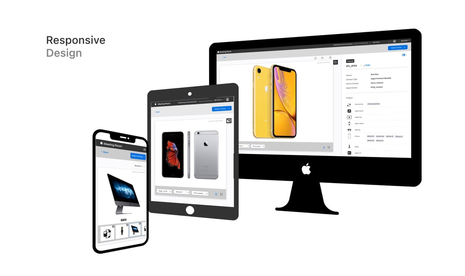
Project overview
Users faced complex navigation, limited interactivity, and collaboration friction. This mattered because the application served 300+ partners globally.
Comprehensively redesign the Meeting Room Application to align with Apple's design principles and improve intuitive navigation, responsiveness, and engagement.
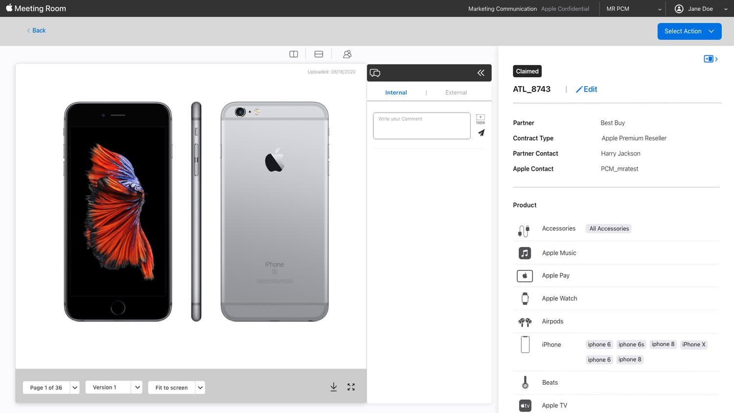
Senior design decisions
Constraint
Partner review tasks crossed desktop, tablet, and mobile while carrying Apple-level expectations for clarity and polish.
Design decision
Move status, comments, file context, and next action closer together so reviewers did not have to reconstruct the workflow.
Tradeoff
Use familiar, restrained patterns instead of novelty so global partners could complete review tasks with less onboarding.
Design process
Research
Mapped partner and marketer pain points in the existing creative review workflow.
Define
Aligned the direction to Apple-style clarity: familiar patterns, common regions, and fewer decision points.
Design
Designed desktop, tablet, and mobile states with a cleaner information hierarchy.
Validate
Integrated PM and stakeholder feedback into refined flows and handoff-ready screens.
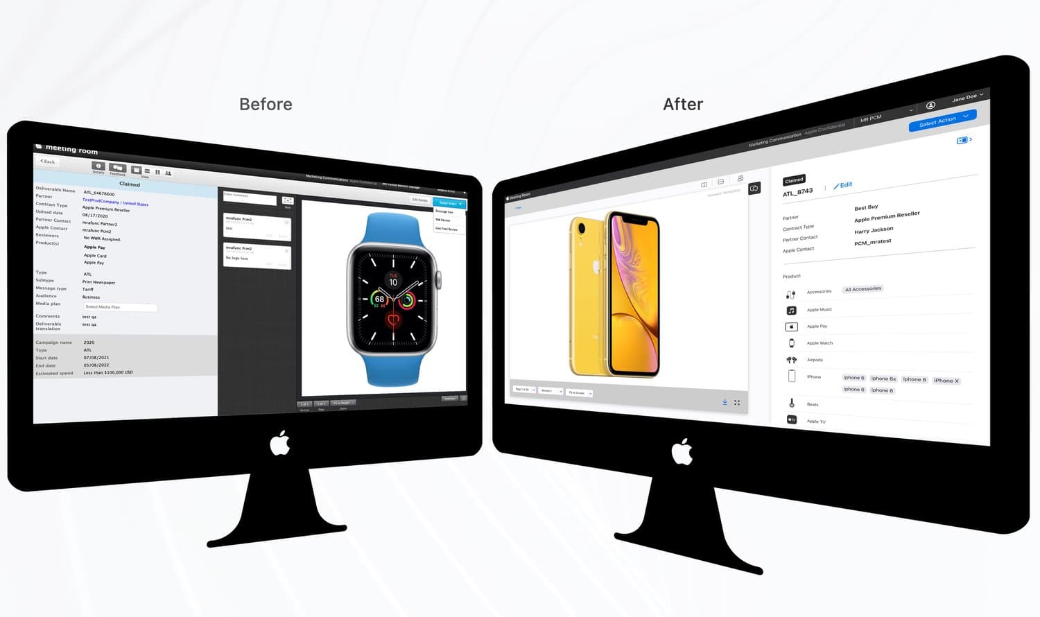
Interface transformations
Reworked the dashboard around scannability, navigation clarity, and review status visibility.
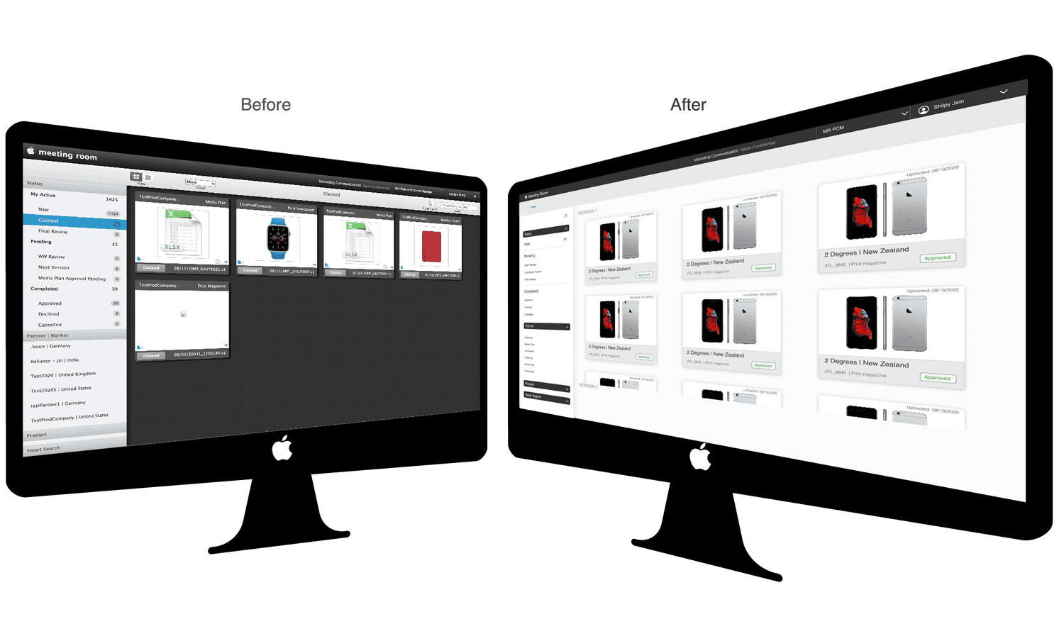
Streamlined search, templates, assets, and permission-heavy workflows for internal operators.
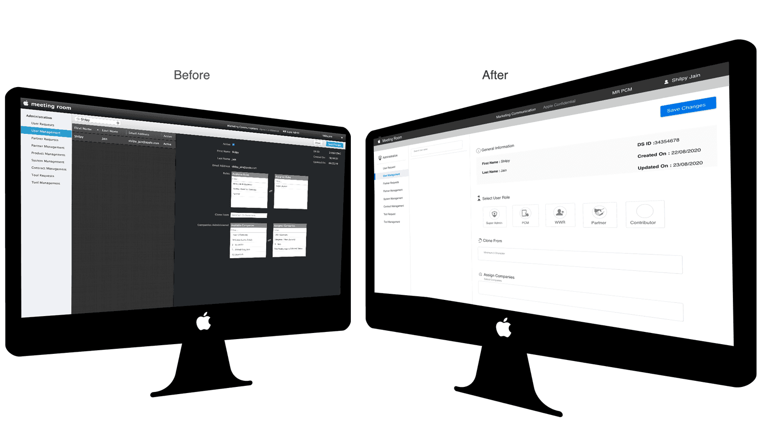
Created a more responsive collaboration surface for 300+ partners reviewing creative assets.
Results & impact
300+
A broad partner workflow needed simpler review, approval, and collaboration patterns.
25%
Responsive review flows made critical actions easier on smaller screens.
40%
Reduced wayfinding effort by clarifying hierarchy and primary actions.
Next case study
Continue to the Amazon Vega OS work to see Shilpy's multi-modal interaction design at platform scale.